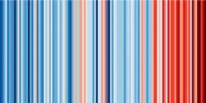
Another abstract art piece that seems beyond comprehension?
Not at all – a graphic representation by the Institute for Environmental Analytics of temperature variations in the world between 1850 and nowadays. Each coloured bar representing the average world temperature of one year.
Generally speaking, you will see bars – years- starting off blue – lower temperatures – before gradually progressing to red tones – warmer temperatures – sign of a global worldwide warming.
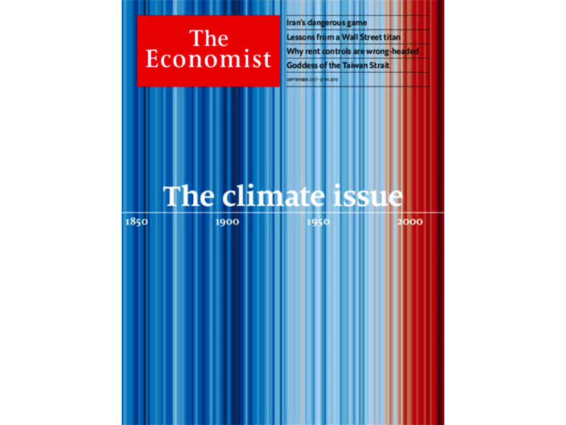
This was engineered by Ed Hawkins’s team to illustrate simply today’s climatic issue. By using the data, it can present such a graph at varying levels – drilling down to focus on a single town. This graph is now adorned by magazines and public figures in the media to bring forward the topic of global warming. By presenting in pictures the first thousand words, this encourages and accelerates the debate to work together at brining effective solutions.
This for example, is the representation of temperature in France between 1901 and 2018.